The experimental book about Pierpont's egyptienne Rockwell from 1934.

To get a better understanding of typography and its characteristics this book analyzes specifically the egyptienne typeface Rockwell.
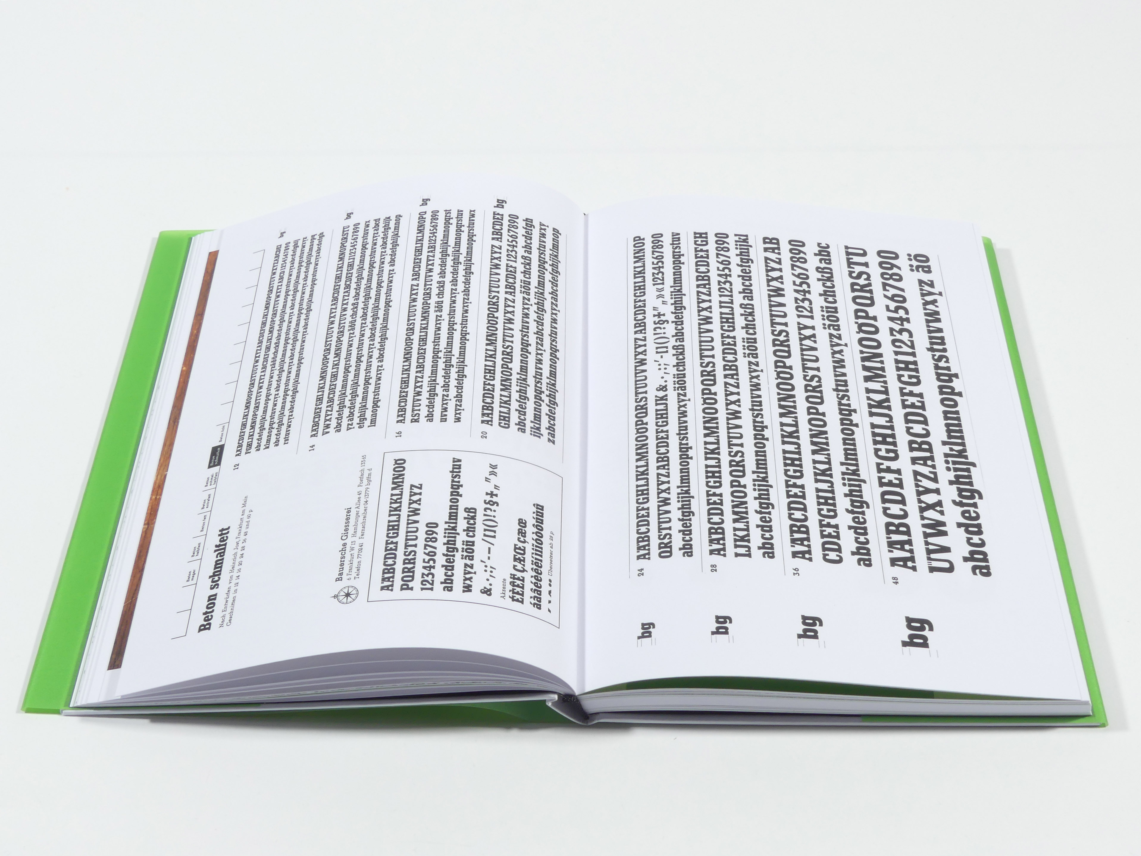
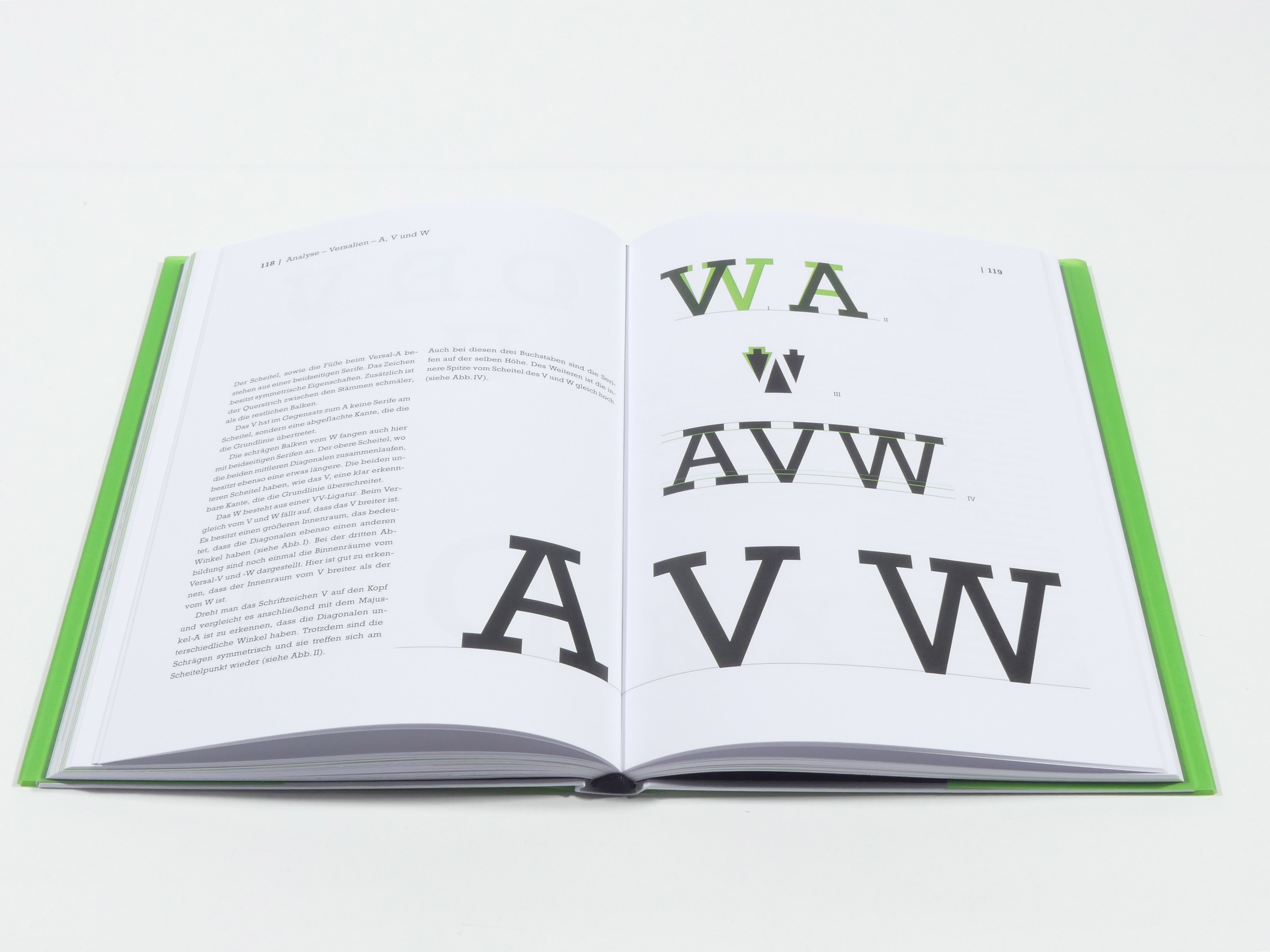
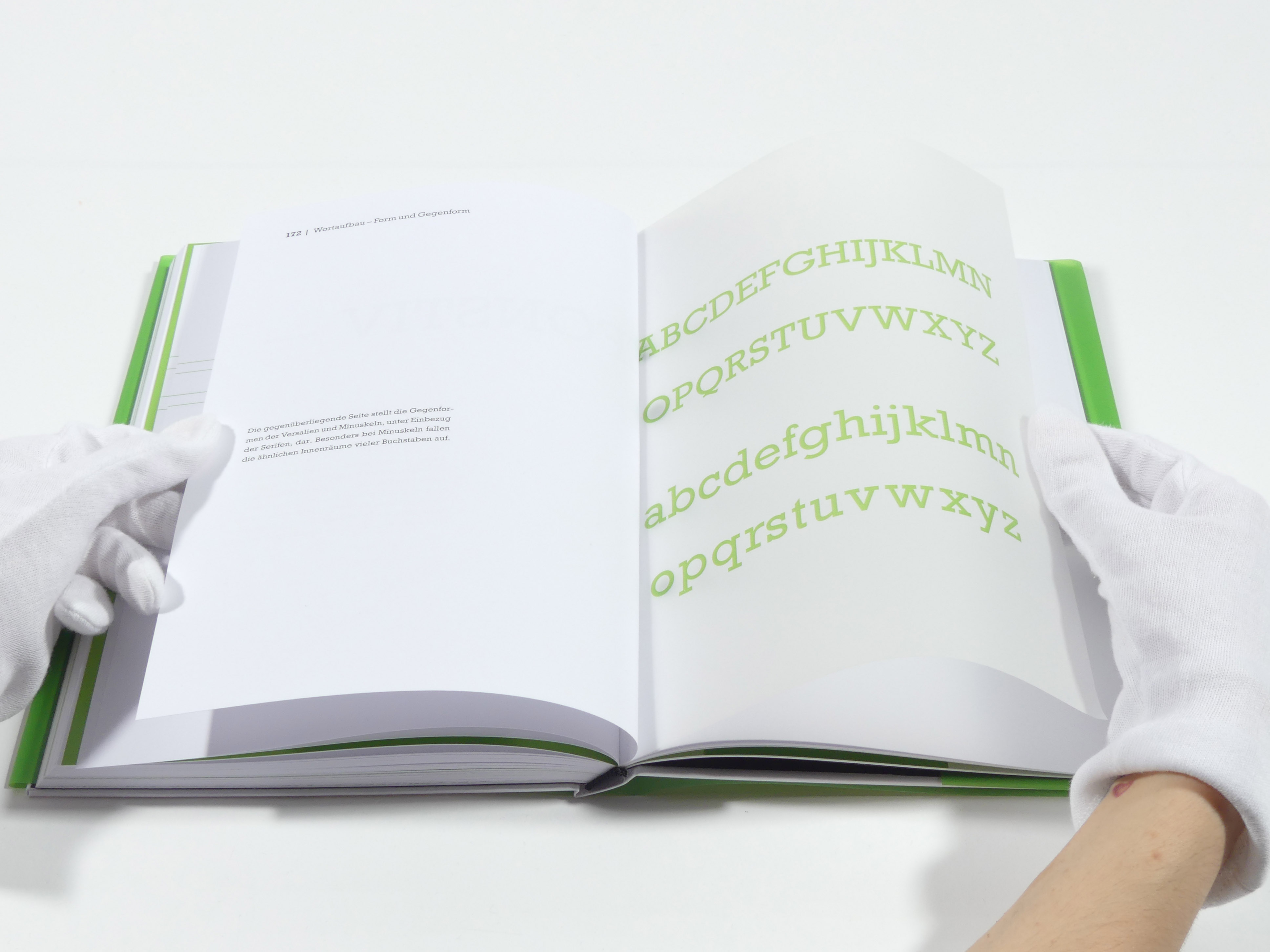
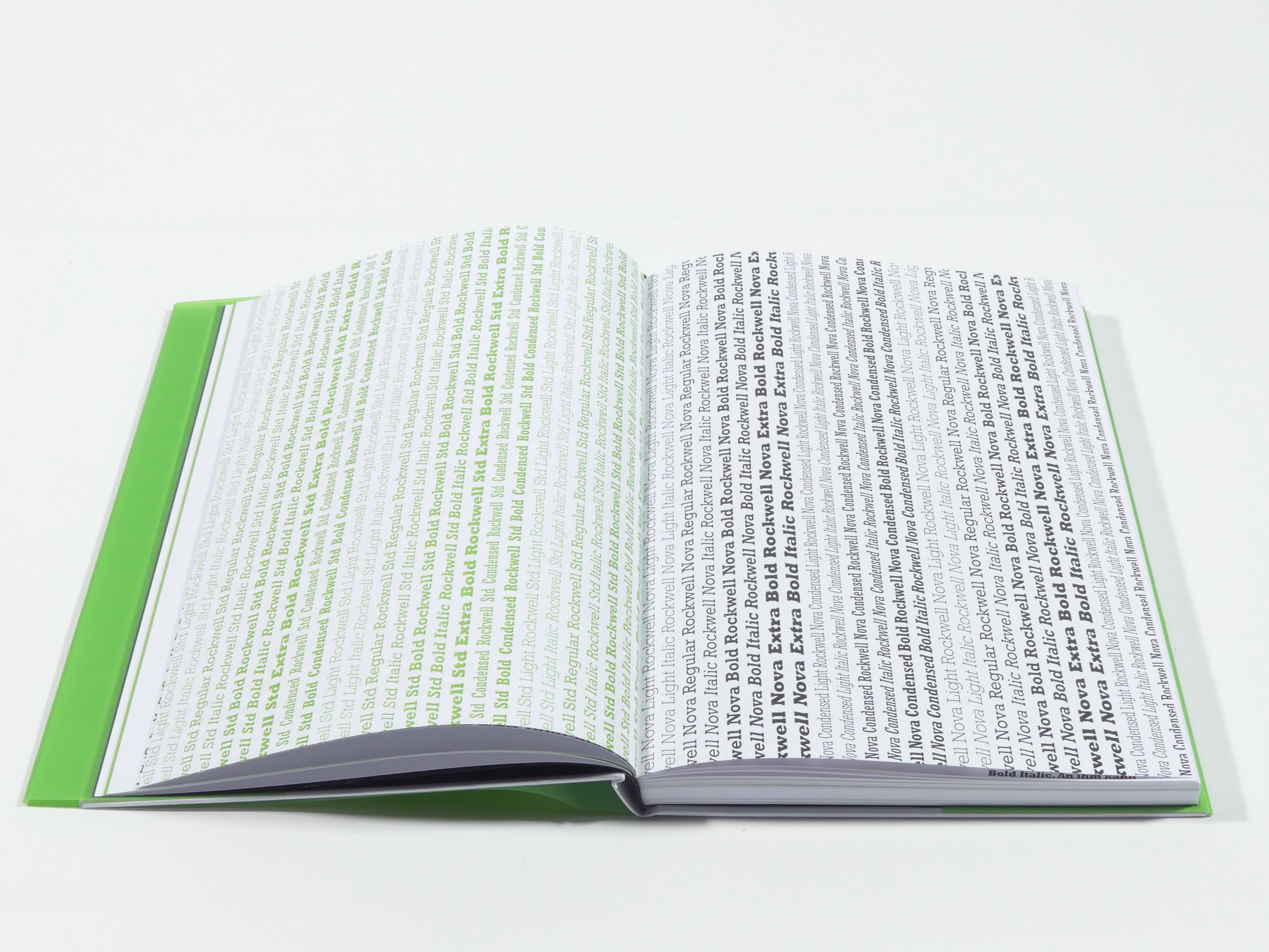
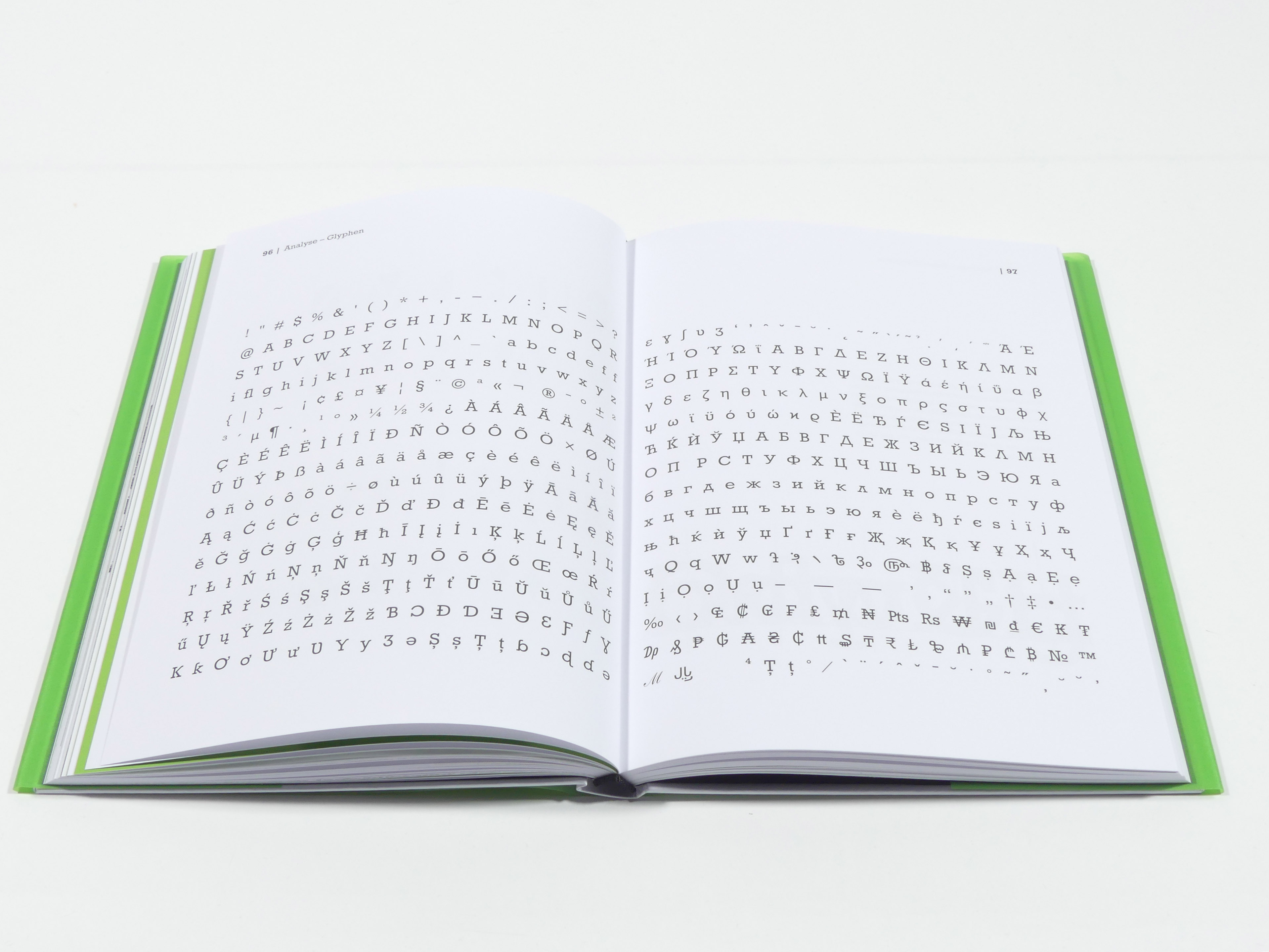
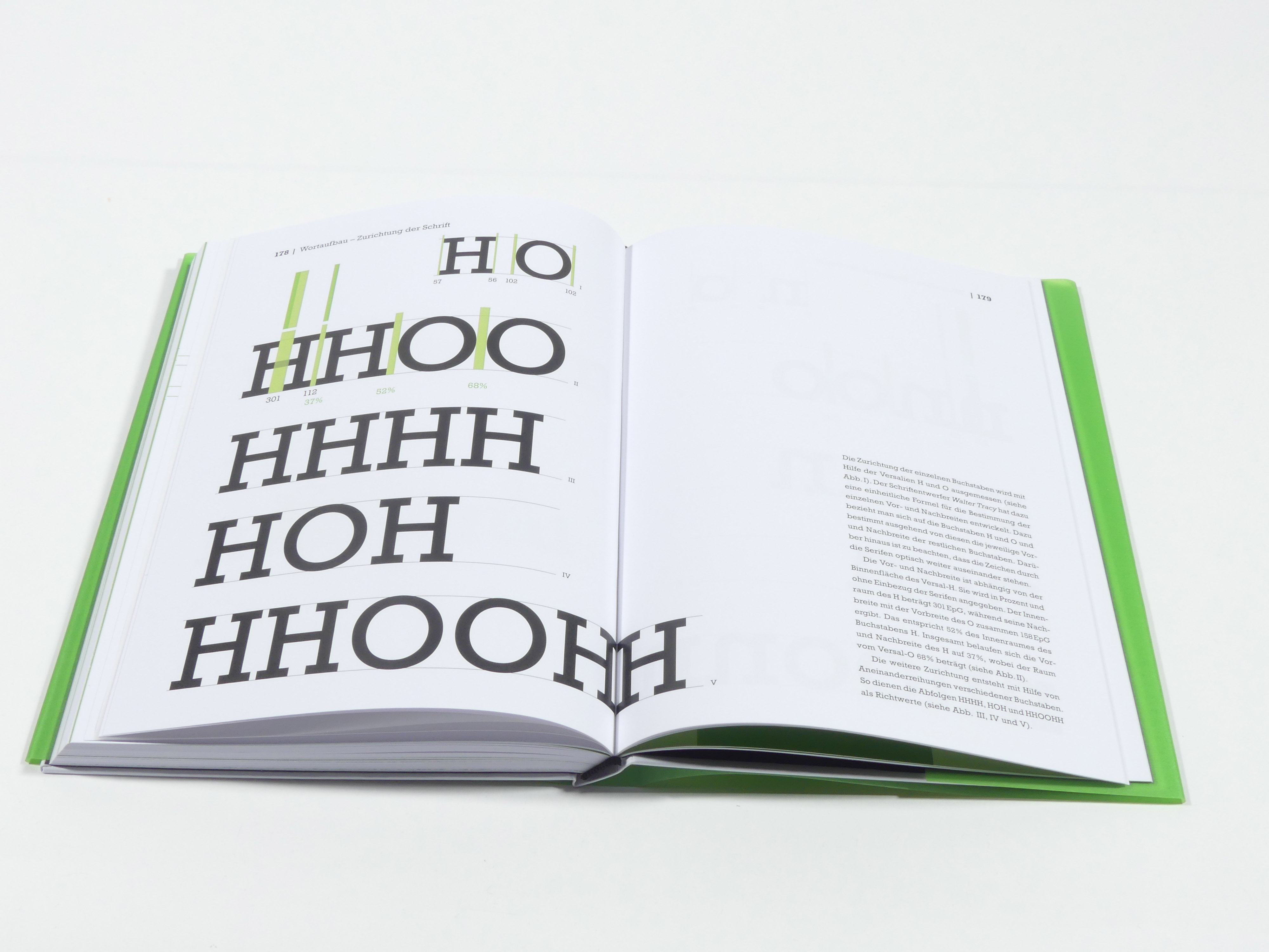
It contains detailed examinations of the typeface's characteristics. That includes the analysis of fonts, weights,letters, line height, letter spacing and more.
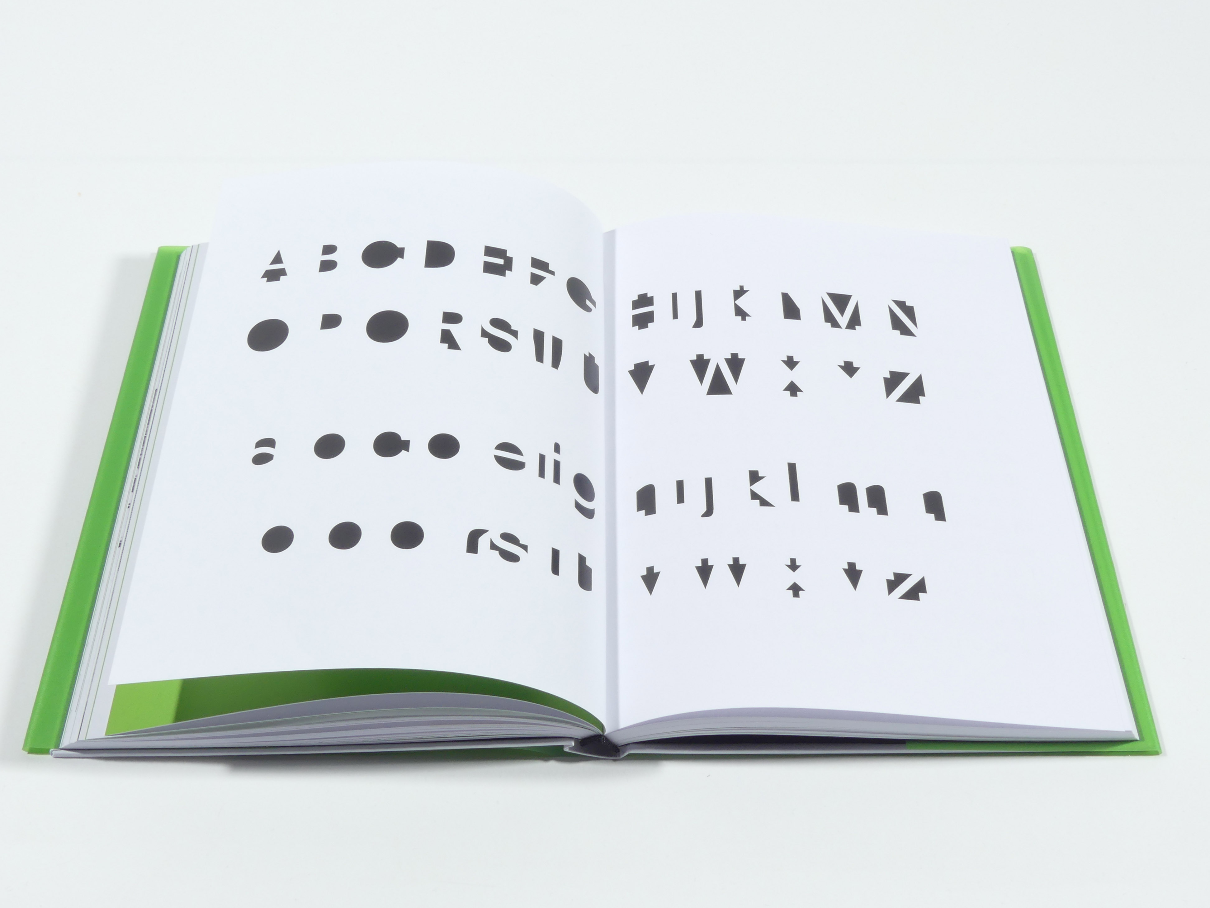
There are chapters that demonstrate Rockwell's origins by showing preceding egyptienne-typefaces and comparing similar fonts. The main examples are Memphis and Beton. The references used from both, come from their lead type letters' shapes.
An important extensive chapter provides information about Monotype and historical printing, since knowledge of the past's available methods is significant for a better understanding of modern typography.
Like that the book connects the history of egyptienne-typefaces in general to Rockwell specifically as it leads to the digitalized variants further into the book.
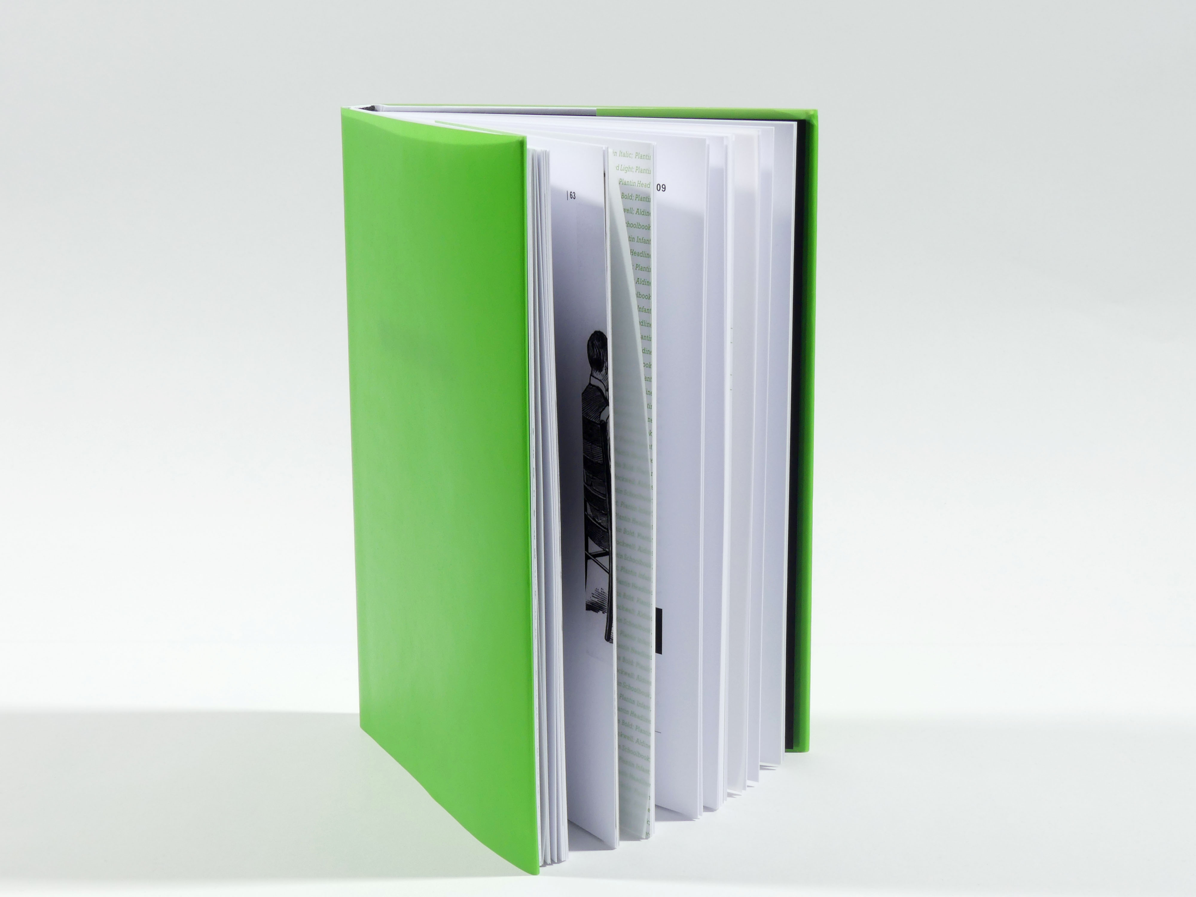
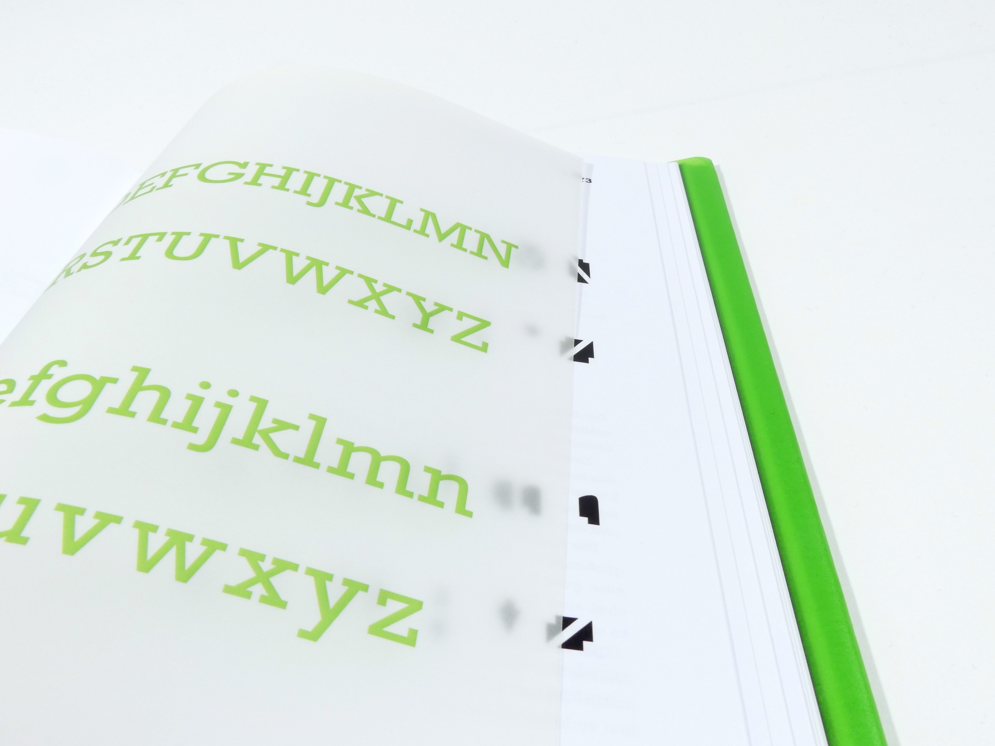
With the goal in mind to maintain an overall modern look of the book, a vibrant green becomes the unusual highlighting colour for the book.
The book contains a few transparent pages that help demonstrate unique characteristics, contribute to the book's unique feel and communicate the multiple facettes of Rockwell as a typeface.
Text and layout is kept simple but does make typographic statements by using elements of type as graphic statements. Experimentally styled pages can be found all throughout the book.

This book was realized as a university project,
together with Celina Hofmann and Michaela Kappes.